Logo Redesign
A fun little assignment of redesigning an already existing logo, since it was a typography assignment the only requirement was for the logo to have some text. The logo i decided to redesign was that of DR. Martins.
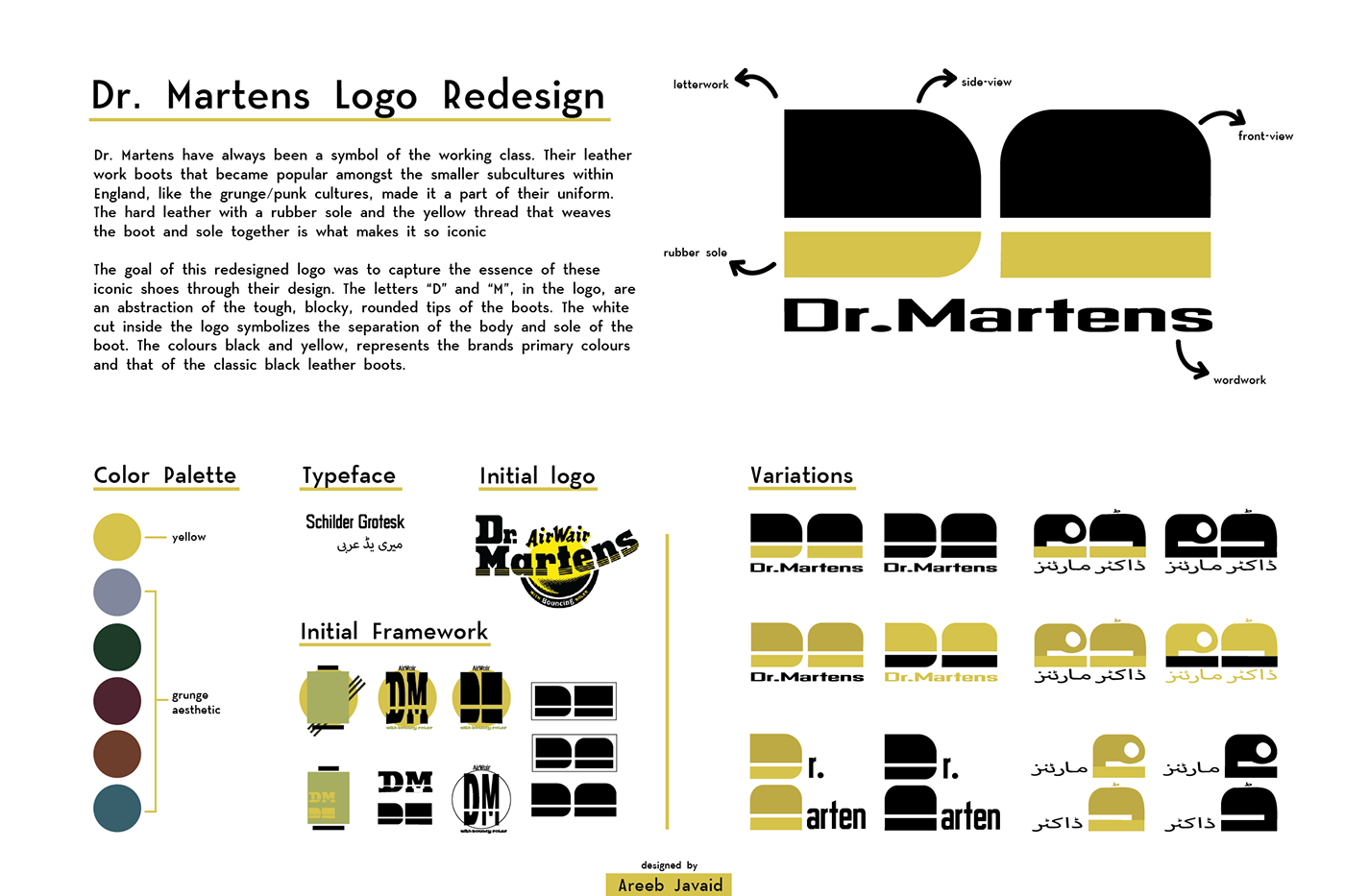
After a bit of researching about the meaning and significance behind their logo i decided to utilize certain elements of the already existing logo. Such as the logo representing the rubber soles in the word "Martin", the yellow color being that of the thread used to weave the sole and the body together, since these two are the main things that makes the Dr. Martins what they are, i saw it fitting to incorporate those into the new logo.
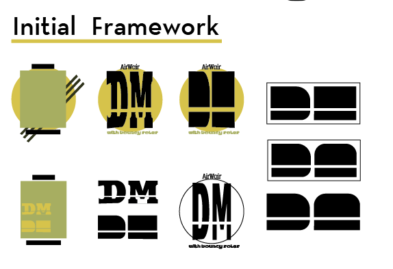
I first started with the rough sketches, randomly placing shapes and lines throwing around color to start the process. The goal was to create a more modern simplified version of the logo.

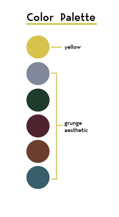
before moving forward i decided to finalize a color palette. Again after more research, i found out that since the shoes are a big part of the grunge culture i looked into some colours that would best represent that, tho i did decide on a few i ended up not using it in the logo, instead i wanted to go for the yellow colour, but a much softer faded version of the original logo.

after all this i tweaked around with the design i decided on and added colours and made a bunch of variations, i also made urdu versions of the logo just to see. i decided on a typeface readjusted it a bit and the design was complete

at the end for presentation sake i compiled the entire process, wrote a small description and printed out the spread.


